How to build an Accessible Dropdown using React Aria


by Nadia Posch
Let me share some tips and tricks we learned using React Aria and React Stately in one of our recent projects. Also, I’ll walk you through how we built an accessible Dropdown where menu items can be passed in as a prop. Checkout the GitHub link at the end for a working example.
When to use React Aria, and Why
If you’re looking for a minimum effort solution to build accessible components, there's probably an existing component library out there that suits your needs. However, if your goal is to build your own custom component library, flexibility is key. And this is where React Aria comes into play.
React Aria leaves the styling and rendering of your components totally up to you. The only thing it provides is accessible behaviour in the form of DOM props.
The principle is easy: you import a hook, pass in some configuration props and a reference element. The hook returns a set of DOM props that can be spread on the element that should become accessible. And voilà!
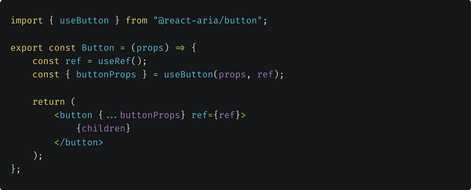
useButton code example from the React Aria documentation
Sounds like a piece of cake? It is, at least for simple elements such as buttons or checkboxes. As soon as the components become more complex, so does the use of the hooks.
Drawbacks
Recently, we developed a custom component library together with one of our customers. The decision to support accessibility and use the React Spectrum Libraries was made only after some of the components had already been built. Introducing the hooks into the already finished components turned out to be quite challenging.
Destructuring
One of the drawbacks we encountered is the lack of destructuring. In the code examples from the docs, props are mostly passed in or spread out without specifying which ones are actually relevant. This makes it hard to understand how the hooks work and what kind of configuration props can be passed in.
In the Button component above, it’s impossible to know which configuration props are set without checking first which props are passed into the component. Instead, if the example were destructured in the following way, it becomes much more understandable:
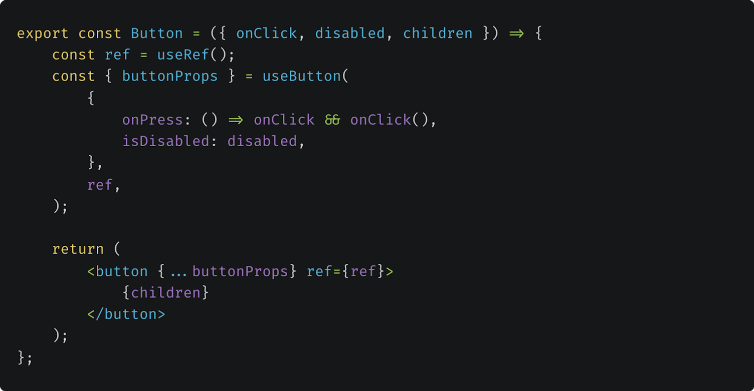
Destructured version of the useButton code example
Typing
Another drawback is the typing. Although React Aria supports TypeScript, some types are inexplicit or more complicated than necessary.
One example is the Selection type in the onSelectionChange hook that’s used in multi-select lists. In the case where all options are selected, instead of passing in a set of all keys there’s a separate “all” string literal for this specific use case. Now, if you’d like to provide your own implementation of onSelectionChange, you need to implement an additional check as well as a getAllKeys method:
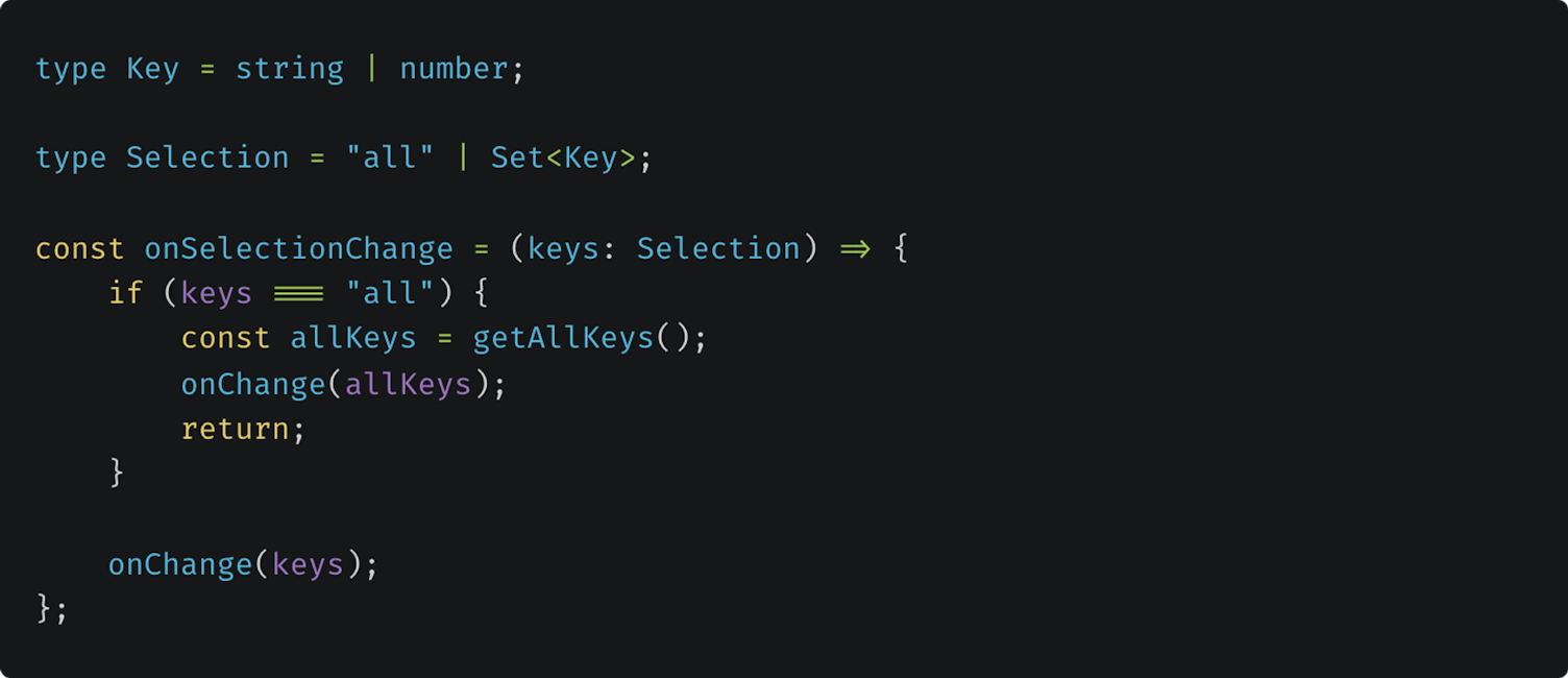
Code example for a custom onSelectionChange method
So, if you’re planning to use React Aria in one of your projects, I’d recommend you look through the code examples in the documentation beforehand in order to get a feeling for how the hooks work. Then you can start structuring your components accordingly. This leads me to the biggest obstacle we faced when introducing the hooks.
Children vs. custom props
One of the major differences in how we built our components and how React Aria hooks work is the use of children instead of custom props. Let’s take a Dropdown as an example. There are two ways to pass in the menu items:
Pass them in as an items prop

Dropdown example that expects items as a custom prop
Pass them in as children

Dropdown example that expects items as children
React Stately's useSelectState hook that’s used to control the internal Dropdown state expects the items as children. If you prefer to pass in the items as a prop however — like we did in our Dropdown — you have to find a workaround.
In the following section, I’d like to walk you through how our accessible Dropdown works in detail. Hopefully, it’ll give you a better understanding for how to work with React Aria and React Stately without having to dive as deep into the documentations as we did. The working example you find at the end is built using NextJS and Tailwind CSS. For the sake of simplicity, class names are left out of the code examples.
How to build an Accessible Dropdown using React Aria and React Stately
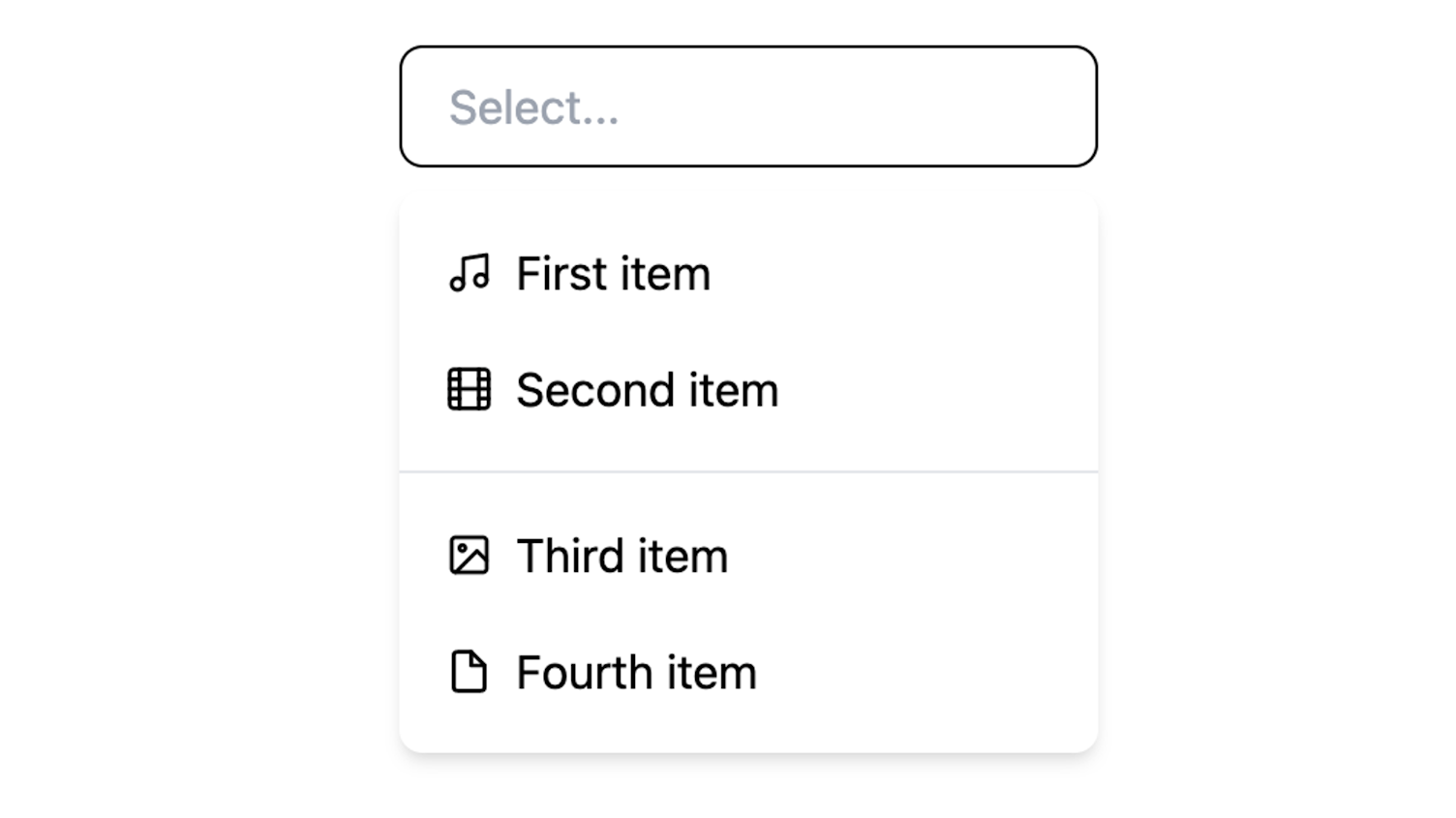
Screenshot of the accessible Dropdown that can be found on GitHub
The hooks we needed in order to make our Dropdown accessible were the useSelectState hook from @react-stately and the useSelect hook from @react-aria, as stated in the useSelect documentation:
useSelect requires knowledge of the options in the select in order to handle keyboard navigation and other interactions.
[…] useSelectState manages the state necessary for multiple selection and exposes a SelectionManager, which makes use of the collection to provide an interface to update the selection state. It also holds state to track if the popup is open.
Necessary props
We decided to pass in the menu items as a custom menuBlocks prop and not as children. Additionally, we needed an onChange method, the activeItemId of the currently selected item and an optional ariaLabel:

Type object for Dropdown props
Our design dictated that the menu items had to be grouped into sections separated by a divider. Each section had to have an id and an optional ariaLabel. Here’s how the menuBlocks object looks that was used in the screenshot above:
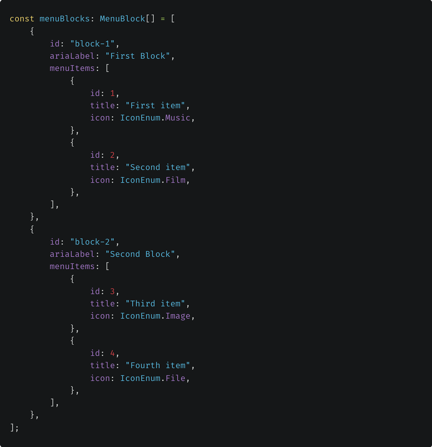
Example menuBlocks object with two sections each containing two items
Mapping items to children
Since the useSelectState and useSelect hooks expect menu items as children, we had to map our menuBlocks array to an object with children. Also, we set the ariaLabel for the Dropdown and the sections.
It’s critical that you import the Section and Item components from @react-stately, otherwise they’re not compatible with the inner workings of the hooks. The content of the Item components is irrelevant though, because we won't render them in the same way as the docs propose.
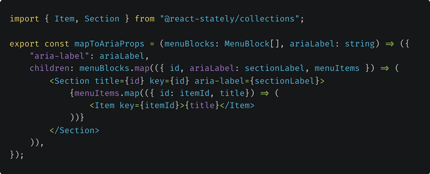
Helper method to map menuBlocks to an object with aria-label and children
Now, we were all set to pass our propsWithChildren object to useSelectState. In addition, we set the currently activeItemId as well as the onChange method that's passed into the Dropdown in order to be able to track the state from outside the component.

Implementation of useSelectState with specific configuration props
Trigger, Overlay and Dropdown components
The trigger and overlay have to be referenced and made accessible with separate hooks: useButton for the trigger and useOverlay for the menu. The opening state of the overlay can be connected to the Dropdown state via the isOpen prop.
Concerning the FocusScope and DismissButton the documentation explains:
In addition, a <FocusScope> is used to automatically restore focus to the trigger when the popup closes. A hidden <DismissButton> is added at the start and end of the popup to allow screen reader users to dismiss the popup.
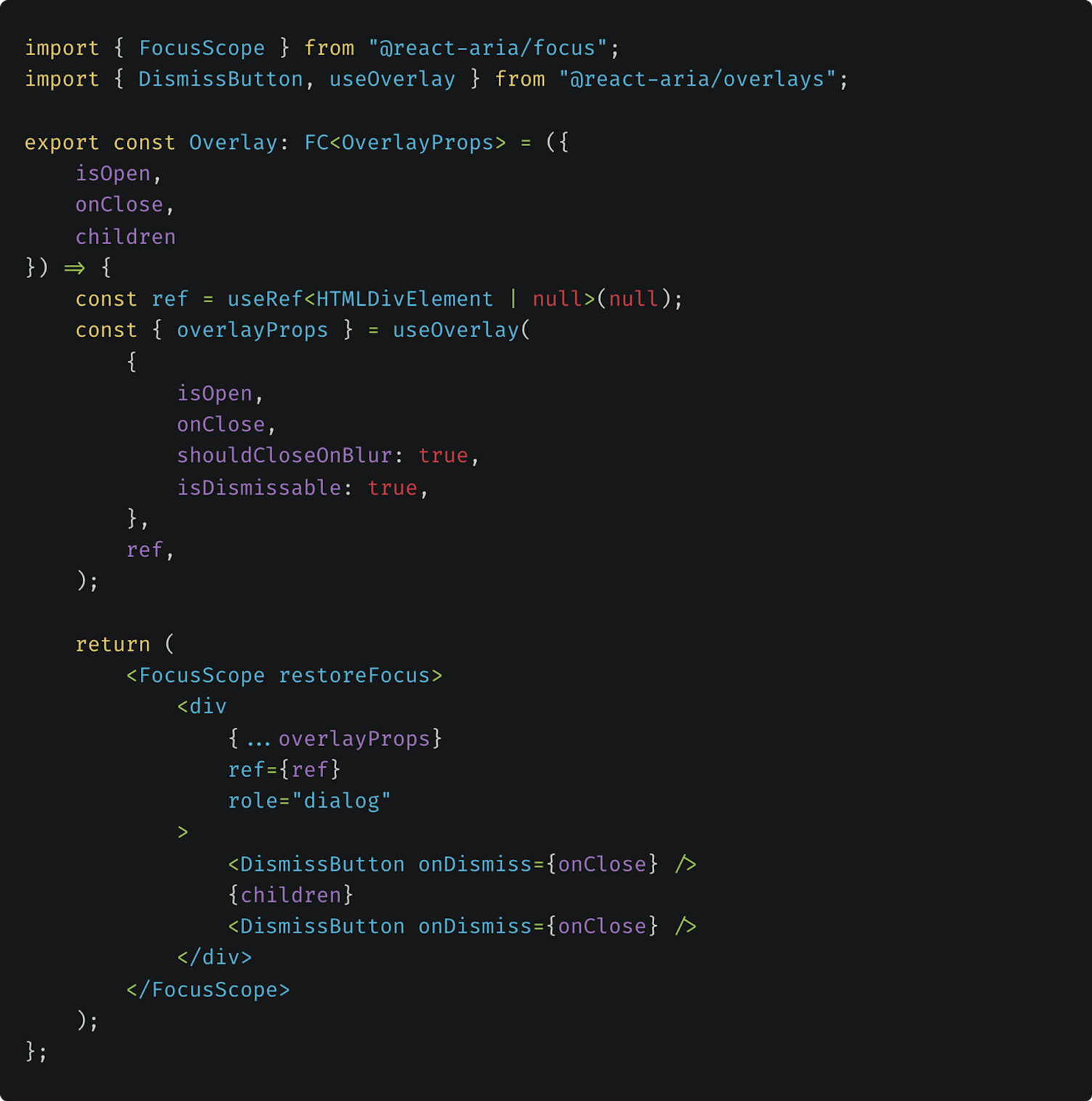
Code example for the Overlay component
Here's how everything comes together in the Dropdown component:
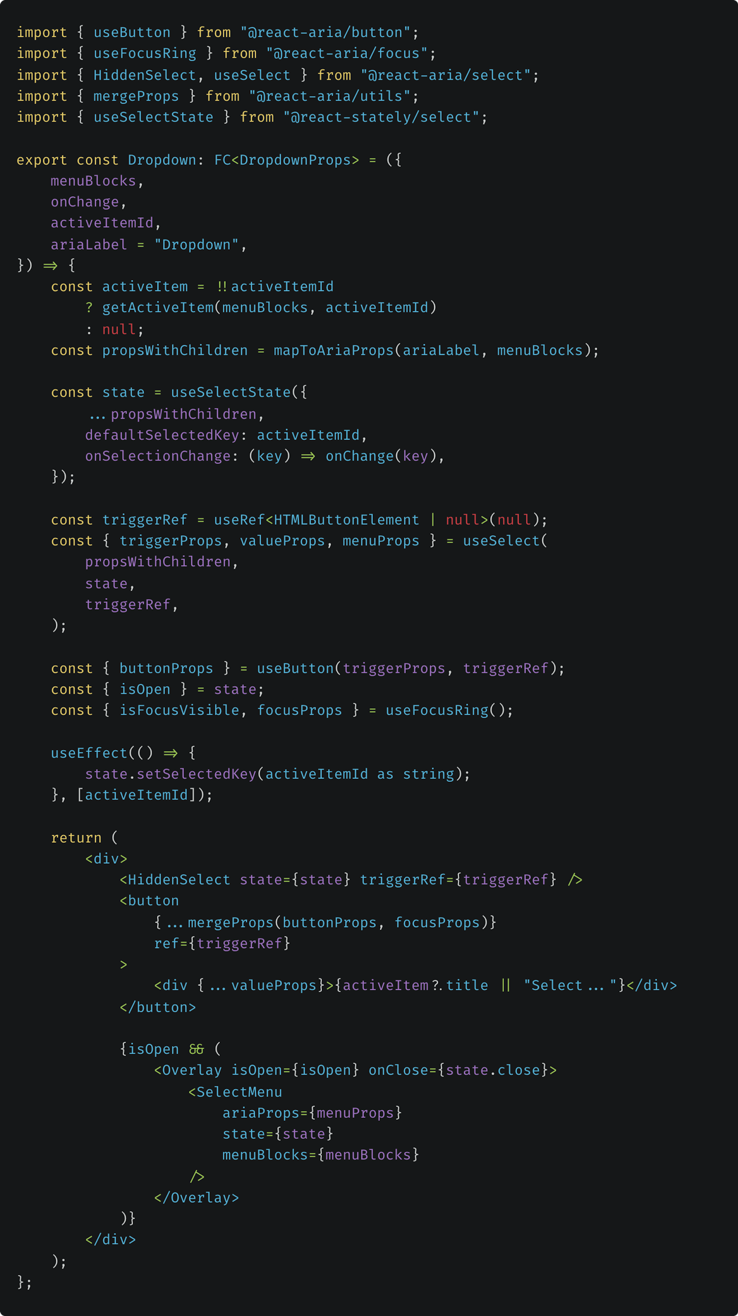
Code example for the Dropdown component
SelectMenu component
The SelectMenu component represents the ListBox that’s used in the code example of the useSelect documentation. And here comes the second reason I’d recommend you start thinking about how to structure your components before introducing the hooks: instead of mapping over an items array, the items are generated by mapping over the internal collection that’s passed in via the state:

Options are generated by mapping over the internal state collection
For us this meant that we weren’t able to access each item as we normally would when mapping over the original items array. The only prop we could access via the state was the item key (id) that was originally set in the mapToAriaProps method.
The solution we came up with was to flatMap all items from the menuBlocks, create a keyItemRecord and access the original item via the key of the childNode which corresponds to the item id. The item could then be passed to the MenuItem component as a prop.
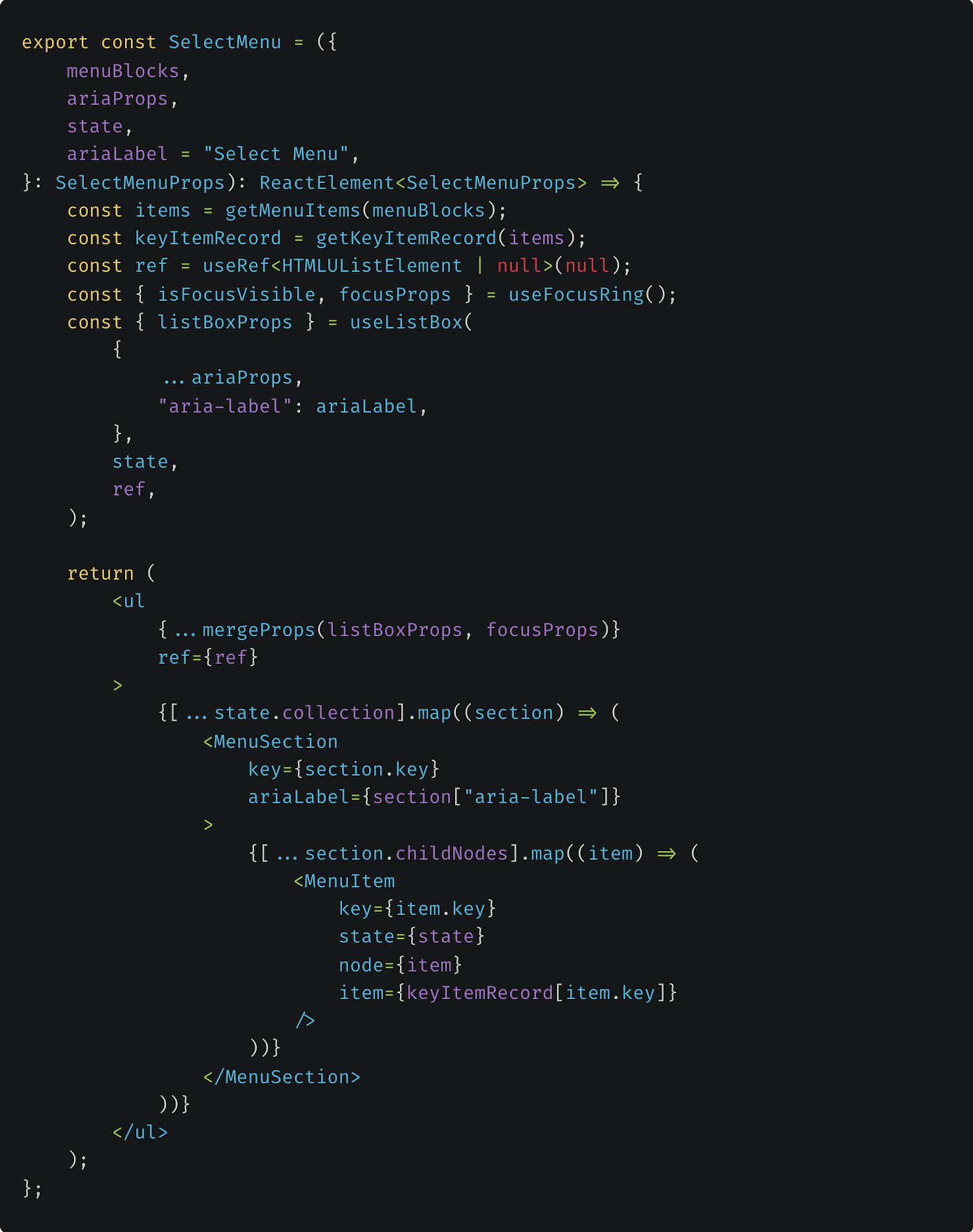
Code example for the SelectMenu component
MenuItem component
The MenuItem component represents the Option that’s used in the ListBox and is the last puzzle piece that’s needed for the Dropdown. Thanks to the keyItemRecord we introduced before, we could now access all necessary information to render each menu item.
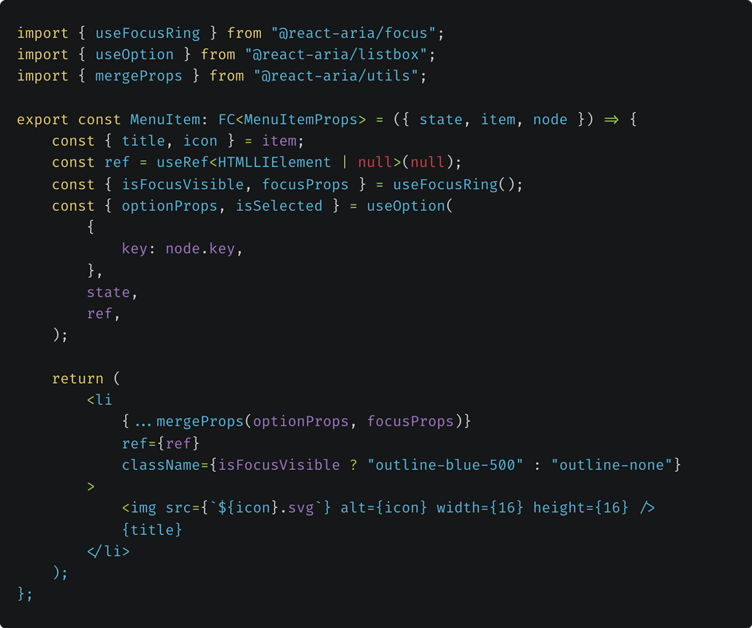
Code example for the MenuItem component
GitHub Repository
You can find a working example of the Dropdown on GitHub. Feel free to use and adapt it to suit your needs. Also, we appreciate your feedback!
Conclusion
React Aria and React Stately are powerful and flexible tools to create accessible components. Depending on the complexity of the components, more insight into the workings of the hooks is needed than just browsing the code examples.
For us, as with every foray into new territories, the initial uncertainty slowly gave way to a steep learning curve. Looking back, it would have been easier to rebuild our Dropdown from scratch and adapt the code structure to the React Aria hooks. However, the need to implement the hooks in our existing code gave us the opportunity to get a deep understanding of how the hooks work.
The key takeaway for me was that thinking about how to structure your components beforehand can save you a substantial amount of time. With that in mind, I would recommend React Aria and React Stately to anyone who plans to build their own custom component library. I hope that some of our learnings will ease your journey if you do decide to use the React Spectrum Libraries in your own projects.