How Tailwind gives you magical design superpowers

Confession: I suck at design
I've been a software engineer for over ten years now, but I never felt comfortable designing things. The user interfaces I had to "design" myself worked - somehow - but shared the unpleasant habit of looking pretty terrible. Therefore, I was constantly bugging my (way more talented) coworkers for design inputs.
My colleague Robert told me about Refactoring UI, claiming that the book would help me become a better designer. Yeah, right. But he kept telling me, so I finally gave it a try - and suddenly there was hope.
Refactoring UI by Adam Wathan & Steve Schoger
The book is mainly about simple principles for UI design. Turns out designing good looking digital interfaces follows a lot of rules. Adhering to them already takes you quite far: from this seems off 🤨 to pretty decent ☺️.
The best thing about this fact: Following the rules of a framework is something I was already quite accustomed to as a software engineer. Gone are thoughts like:
«I know this looks terrible but I have no idea why.»
Yep, exactly how I felt before. The book has tangible recipes to overcome that issue. It presents answers that sounded logical to me. Let's take a sneak peek at some of the design principles covered in the book.
1. Establish a spacing and sizing system
This one is about consistency. If you use predefined spaces and sizes everywhere, it already starts to look like somebody has thought about the design.
«You shouldn’t be nitpicking between 120px and 125px when trying to decide on the perfect size for an element in your UI. Painfully trialing arbitrary values one pixel at a time will drastically slow you down at best, and create ugly, inconsistent designs at worst.»
But the really magical superpower part to me is:
«A linear scale won’t work.»
Take the difference between 12px and 16px: pretty significant, right? At the same time, the difference between 70px and 74px is barely noticeable, although both differ by the same number of pixels.
2. Establish a type scale
Like the previous point, but considering your font sizes.
«Most interfaces use way too many font sizes. Unless a team has a rigid design system in place, it’s not uncommon to find that every pixel value from 10px to 24px has been used in the UI somewhere.»
And of course:
«Just like with spacing and sizing, a linear scale won’t work.»
The book concludes that you could use a modular scale like the golden ratio but recommends a hand-crafted scale as it works better.
3. You need more colors than you think
The book talks about three different kinds of colors that you will need for modern application design:
- greys (including black and white) > for text, backgrounds, panels, and form controls
- primary colors (often the brand color)> for primary actions, active navigation elements, and so forth.
- accent colors> for highlights, errors, warnings, and hints
It continues on how you should approach selecting the colors and that you will encounter a lot of situations where you'll need multiple shades of the same base color.
«All in, it’s not uncommon to need as many as ten different colors with 5-10 shades each for a complex UI.»
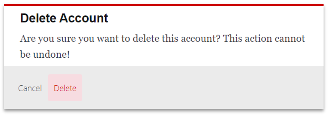
For example: The simple alert box below, we already need five different colors and two different shades of red. And we didn't even add an interactive :hover state or an icon, which we absolutely should, to make deleting an account a bit more fun.

What has that got to do with Tailwind?
Well, only everything. Because Adam Wathan and Steve Schoger are the guys behind Refactoring UI and behind Tailwind. And they made it really easy for us to adhere to the principles of the Refactoring UI Book with Tailwind. Consider the included default spacing and sizing scale for example:
module.exports = {
  theme: {
    spacing: {
      1: '4px',
      1.5: '6px',
      2: '8px',
      // ...
      4: '16px',
      5: '20px',
      // ...
      12: '48px'
      14: '56px'
      16: '64px',
    }
  }
}
If you don't know Tailwind: The spacing scale gets applied to things like padding, margin, width, and so on. Tailwind then generates CSS-classes like p-2 or w-4. You can use these classes to set a padding/width using the values from the configured spacing system.
<!-- sets a padding of 8px -->
<p class="p-2">lorem ipsum ...</p>

<!-- sets the width of the image to 16px -->
<img src="image.png" class="w-4" />
Remember, the book mentioned that a linear spacing scale wouldn't work? That's why (in the default Tailwind spacing scale) there is no 15:'60px'. Because they already did the non-linear spacing scale thing for us.****
And they provide us with a default type scale. As well as an awesome color palette with all the shades you'll ever need. Of course, there are many tips and tricks in the book independent from Tailwind, which is why I highly recommend reading it anyways. But, in case you don't have time right now, or you just really hate reading books, I claim that:
«💡 Simply by using Tailwind with all its default configurations you will become a better designer.»
(Unless you're already a pro designer, that is...)

Geschrieben von
Josh Wirth


