Design tokens: The end of the ping-pong between design and development

The big website redesign is here! 🖌️
Imagine this: The branding department launches a new Figma prototype and gives the website an upgrade: new color palette, new font, new logo, new icon sets and suddenly everything looks much more modern. The customer portal, mobile app and quotation tool are also to be given a new look.
Ok let's code this 👩💻
Maybe you're lucky and you have a central design system with reusable components for the various applications. This means that you only have to make the changes in one place.
Ping-Pong 🏓
But who isn't familiar with the constant ping-pong between design and development?
- "I have increased the font size in Figma by 2px, can you adjust this in the code?"
- "What should the button on-hover look like, I can't find it in Figma."
- "I've changed the color of the heading slightly, could you add that to the code?"
- "Are there specific distances between the paragraphs? I can't find anything about this in Figma."
- "..."
The longer this back and forth goes on, the more inconsistent the design becomes. Without strict discipline, it becomes tedious and time-consuming to constantly discuss design details.
And then there are the many brands and themes 🙄
Of course, your design system is pretty cool and also has a dark mode. And for maximum flexibility, it even supports multiple brands so that it can also be used by partners. But more possibilities also mean more discussions about design, right?
Design consistency across multiple technologies
With a centralized design system, the problem is limited to one place, but the reality is often more complex, especially with different technologies in play.
Two birds with one stone thanks to design tokens 🎉
With Design Tokens, you not only avoid the annoying ping-pong game between design and development, but also effortlessly integrate new brands without any development effort.

What are design tokens?
Design tokens are basic building blocks for consistent UI design. These include colors, fonts, spacing, borders, etc. These are defined in one place in Figma and ultimately used in various UI components in the code. Defined centrally, they enable simple adjustments and facilitate the introduction of new brands by defining new token sets.
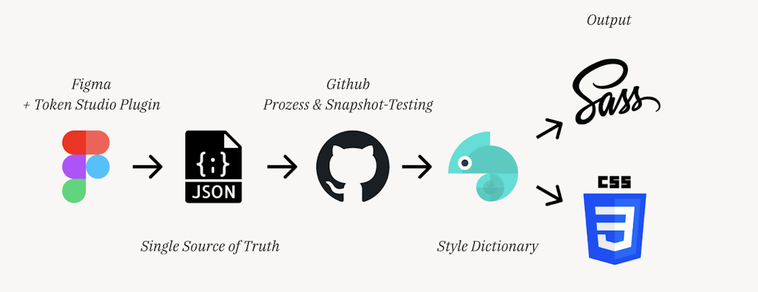
Figma meets css in 4 steps
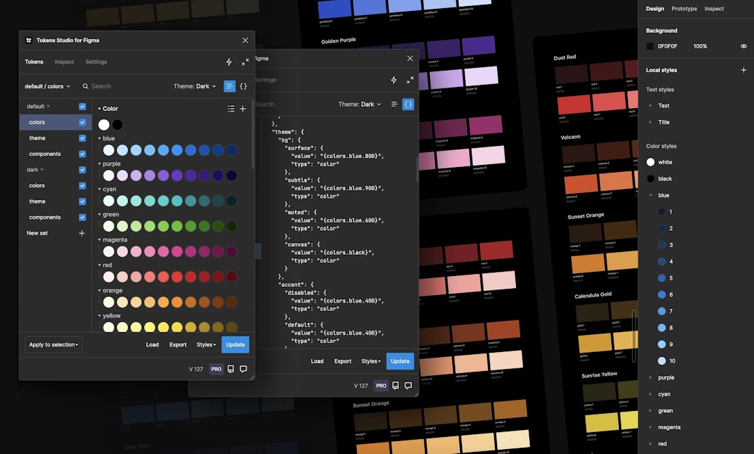
Step 1: Design tokens with Tokens-Studio
Open Figma and get the Figma-Plugin Tokens-Studio. You can define all your design tokens there.

Step 2: Git repository for JSON files
Connect Tokens Studio to a Git repository so that your tokens are securely stored and versioned. Only in this way can they serve as a reliable source for the transformation to CSS variables.
{
  "colors": {
    "button": {
      "background": {
        "default": { "value": "#3e7fc3" },
        "disabled": { "value": "#b83a3a" },
        "hover": { "value": "#8c564b" }
      },
      "text": {
        "default": { "value": "#ffffff" },
        "disabled": { "value": "#999999" },
        "hover": { "value": "#ffcc00" }
      }
    }
  },
  "radii": {
    "button": {
      "border": {
        "width": { "value": "2px" },
        "style": { "value": "solid" },
        "radius": {
          "default": { "value": "5px" },
          "disabled": { "value": "{radii.none.value}" },
          "hover": { "value": "{radii.sm.value}" }
        }
      }
    }
  },
  "spacing": {
    "button": {
      "padding": {
        "vertical": { "value": "10px" },
        "horizontal": { "value": "20px" }
      }
    }
  }
}
Step 3: JSON --> CSS with style dictionary
Then use Style Dictionaryto convert the tokens from JSON into CSS variables. It is best to package them in an NPM package that is automatically updated via your build pipeline. This way, Figma adjustments lead directly to new versions of the CSS package.
:root {
  --button-background-default: #3e7fc3;
  --button-background-disabled: #b83a3a;
  --button-background-hover: #8c564b;

  --button-text-default: #ffffff;
  --button-text-disabled: #999999;
  --button-text-hover: #ffcc00;

  --button-border-width: 2px;
  --button-border-style: solid;
  --button-border-radius: 5px;

  --button-padding-vertical: 10px;
  --button-padding-horizontal: 20px;
}
Step 4: Use CSS variables in your components
Now you have a huge pile of CSS variables that you can easily use in your UI components.
.button {
  background-color: var(--button-background-default);
  color: var(--button-text-default);
  border: var(--button-border-width) var(--button-border-style) var(--button-background-default);
  padding: var(--button-padding-vertical) var(--button-padding-horizontal);
  border-radius: var(--button-border-radius);
}

.button:disabled {
  background-color: var(--button-background-disabled);
  border-color: var(--button-background-disabled);
  color: var(--button-text-disabled);
}

.button:hover {
  background-color: var(--button-background-hover);
  color: var(--button-text-hover);
  border-color: var(--button-background-hover);
}
And that's it already 👏
Want to change your primary color?
No problem! The customization in Figma triggers a build pipeline. This regenerates the values in your CSS variables and makes them available via the NPM package. In your web application, all you have to do is update the version and the new color will appear on your website.
Does your multi-brand platform need a new brand or a dark mode?
Easy! Simply define a new token set in Figma and it will be automatically integrated into your app via the pipeline. In the end, the new Figma token sets in the code are nothing more than additional CSS files. Next to your brand-1-light.css then you simply have an additional brand-2-light.css or a brand-1-dark.css.
Pro tip: Use snapshot testing and review processes 👀
The design department now has a lot of power. A single wrong token update could destroy the overall image of the website. With snapshot testing from Playwright or Cypress, such problems can be detected early and integrated into the CI/CD pipeline. This allows you to discover potential errors before they have an impact on the productive environment.
The art of naming
One of the biggest challenges is to define a suitable design token name. Button-Color alone is not enough, as there is probably also a secondary button. Then there are also differences between border color, background color, text color, etc., as well as states such as hover, pressed, active, etc. Thinking about and documenting a naming convention at an early stage is extremely important. Ultimately, there are many possibilities, the important thing is to be consistent.
Your CSS package as public design guidelines
If you even publish your CSS package or make it available to selected partners, they can easily recreate UI elements in your style. This is because the CSS variables contain very clear definitions of how individual components must be designed.
Design tokens, yes no maybe?
Ok, that all sounds very simple and positive at first and as if it's the perfect solution for everyone. But is it really?
Advantages 👍
- Single source of truth in Figma: Ensures consistent and uniform UI elements.
- Technology agnostic: Works independently of specific technologies and offers flexibility in implementation.
- Efficient collaboration: Minimizes the coordination effort between design and development.
- Easy integration of new brands: Simplifies the integration of new brands without development bottlenecks.
- Automated updates: Updates design changes automatically via the build pipeline.
Disadvantages 👎
- UI/UX effort: Figma work is becoming more complex.
- Increase in complexity: The risk of increasing complexity of the software architecture.
- Learning curve for teams: The challenge of implementation.
- Tool dependency: The risk of being dependent on certain tools.
- Potential overhead costs: Initial investment and resources.
Conclusion
"Well, it depends."
The use of design tokens depends heavily on the project in question. In smaller projects, the use of design tokens is probably overkill, as the initial setup is quite time-consuming. But in more complex environments, it is definitely a worthwhile investment.
Nevertheless, you have to be aware that it can lead to a bottleneck in the UI/UX area, as development alone can no longer make changes as flexibly.
It is important to consider how far you want to go. Should all components be tokenized? If so, how exactly? Down to the smallest detail or rather superficially with a focus on colors and fonts?
In addition, third-party CSS frameworks can make life more difficult by complicating the overwriting of styles. Ultimately, it's a balance between flexibility and complexity that needs to be kept in mind.
TL;DR
Setting up the complete Design Tokens workflow takes time and is not that easy. But once it's up and running, it's brilliant! 😍

Written by
Raphael Wirth


